

Template Operation Manual
MesaOS
We’ve developed a method of working in Squarespace that’s intuitive, functional, and more consistent across designs. Instead of trying to add custom elements to Squarespace, we modify the underlying structure — meaning, you don’t have to be able to code, just use the platform as intended. Let’s get started.
↓
Split Sections
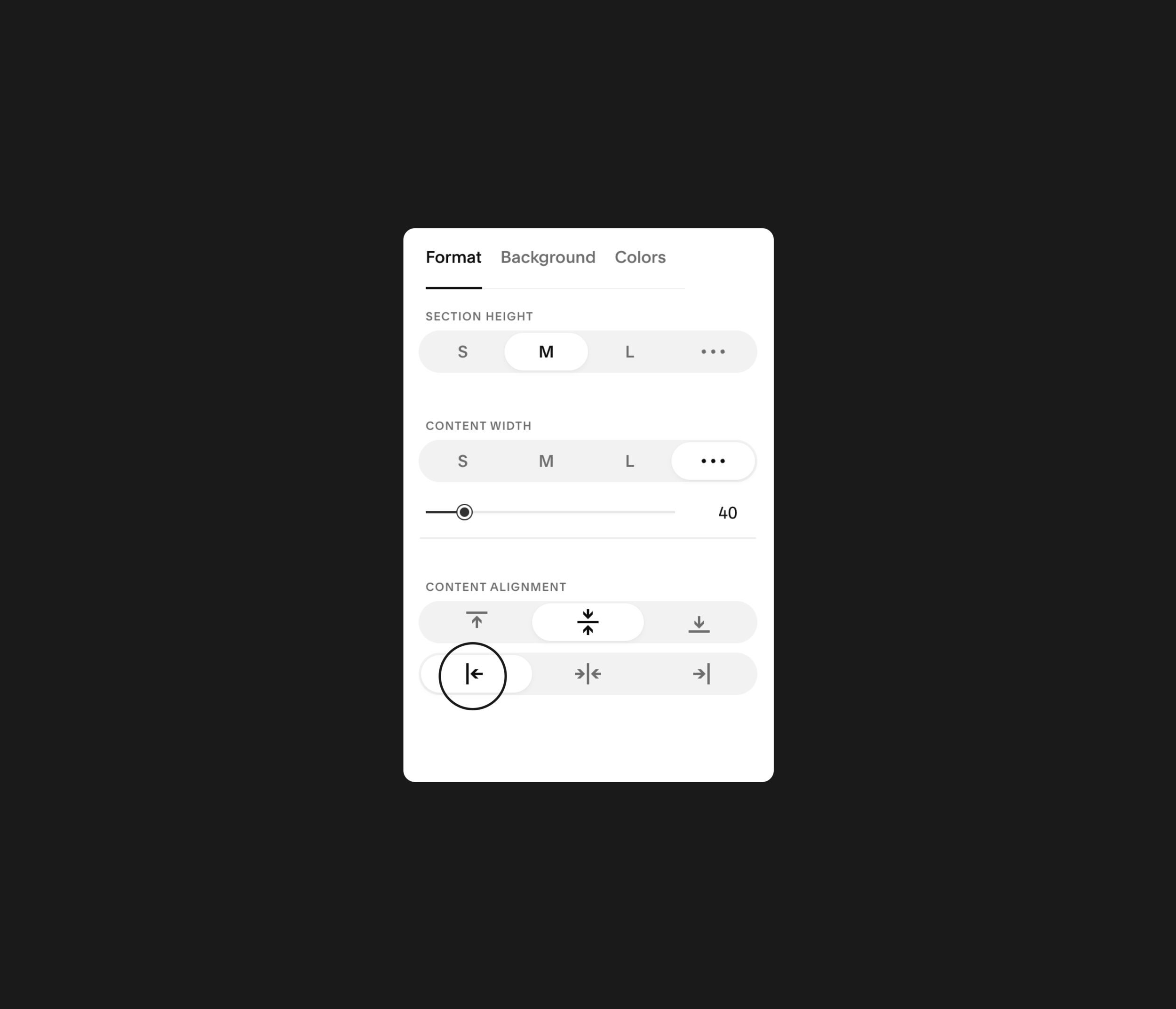
Squarespace still doesn’t offer native split sections, so we made our own. Here’s how it works in all templates:
1. Add a background image
2. Set the content width to custom
3. Align content to the left or right
4. Select the first of any section color

Section Colors
Any Section Color will work with Split Sections — this gives flexibility to create some interesting and useful combinations. For example, this template is set so that Light 1 and Light 2 have different amount of border radius.
Content Spacing
Content within split sections are constrained by the site-wide max-width (must be set within the Custom CSS window). This is so text stays tidy even when someone views on a larger screen.

Section Rounding
Make sections “overlap” by setting Content Alignment to top. Note: You may need to increase the Section Height of the overlapped page if anything’s covered.

Centering Content
Want to make content centered instead of top-aligned? Pick one of the default Section Height settings to center the content. Works on any Content Alignment.
Custom CSS
While there is quite a bit of Custom CSS at work to make your template work and feel the way it does, you’ll never have to touch about 99% of it. But for that 1% you may want to change, start by going to “Design” > “Custom CSS”.
Add Site Colors
Squarespace sites have five built-in color swatches: White, Light, Accent, Dark, and Black. When you change these in the Site Styles, you must change them here in the Custom CSS. Simply get the HEX code for each color, and paste them into the corresponding space.
Site Max Width
More than likely, you won’t be changing this — after all, your template is already setup and optimized for this specific design! But, if you need to, simply copy what you input in the Spacing panel here, and everything will automatically adjust.
Site Fonts
Once you’ve found the font you’d like to use, go to typekit.com and search for the Adobe font you’re using. Click “Add to Web Project”, complete the prompts, and copy the text within the parenthesis. Paste it here and you’re golden!
Header Height
Normally you’d select the header’s padding in the header menu, but because we need to leave space for the Split Section images, it needs to be set here. Simply increase or decrease to taste!
UPDATE 3.1.22 – Squarespace updated something and this method is no longer active. Adjust header height as normal!

Small Card
Select “Small” for Content Width.
Note: Most Section Cards will require extra spacing on the top and bottom, so either add Spacer Blocks to adjacent sections, or make “spacer” sections above and below to correct.
Medium Card
Select “Small” for Content Width.
Large Card
Select “Inset” in section background settings.

Testimonials Slider
Adding new client reviews to the Testimonial Slider is easy!
In Pages, go to “Testimonials” (greyed out = hidden)
Create a new post and hit save (don’t worry about content)
Edit the post’s page settings (three dots, “settings”)
Add the review in “Excerpt” (use this format)
Publish your new review!
Changing Icons
Want to make icons your own?
Download an SVG icon from somewhere like The Noun Project. It cannot be a PNG!
Right click on the file and “Open With” > TextEdit.
Next, in Squarespace — while editing the page, double-click on the code block containing the current icon.
Copy + paste the new code you just viewed in TextEdit, replacing the highlighted code you see here.
At the beginning of the code, you’ll probably see “height=’1200pt” and “width=’1200pt’” — delete this, and replace it with this: class=”parable-icon”

Contact Forms
Forms are really easy to make messy, unprofessional, and out-of-hand with design — so, we make it super simple. A few rules you should follow with any forms you make with this template:
Single-Span Fields — Whatever form fields you want to include, only use ones that span one field-width (not phone number, address etc). Text fields, multi-select, and dropdown work great.
Field Split — The first four fields will split equally in half, so make sure to adhere to the first rule to keep everything looking good.
Only Description — We hide the field label and only show the description to reduce visual clutter. But, make sure to still complete the label section for auto-fill use.